In an effort to enhance the user experience and address specific pain points within the Snapchat app, I embarked on a redesign project aimed at restructuring the app’s layout. My primary focus was on improving the visibility and accessibility of key features, such as the Stories section.

Affinity Map
Step 1: Import the data from research
I conducted interviews with five individuals to better understand how they use Snapchat and how they feel about the app. The questions were designed to uncover insights into their preferences and overall experience. After gathering their feedback, I organized the responses into an Affinity Map to identity key patterns and themes that informed the next steps in my design process.
Step 2: Identify patterns and categorize them into themes
Step 3: Establish three key findings
User Persona & Journey Map
Step 4: Create a user persona and journey map to cater to the needs, behaviors, and preferences of a specific audience
Crazy 8’s & Wireframe
Step 5: Explored design ideas using the Crazy 8’s method
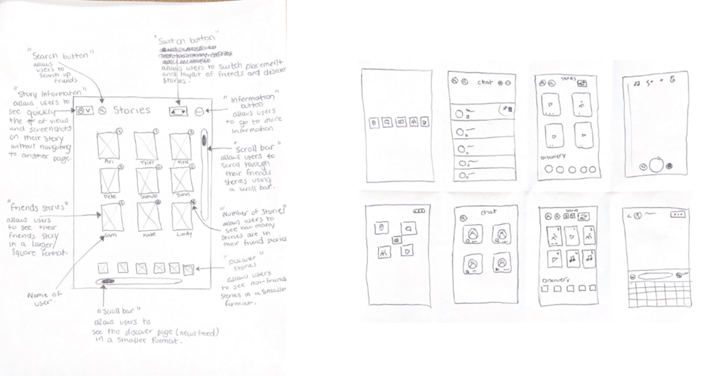
Initial Prototype
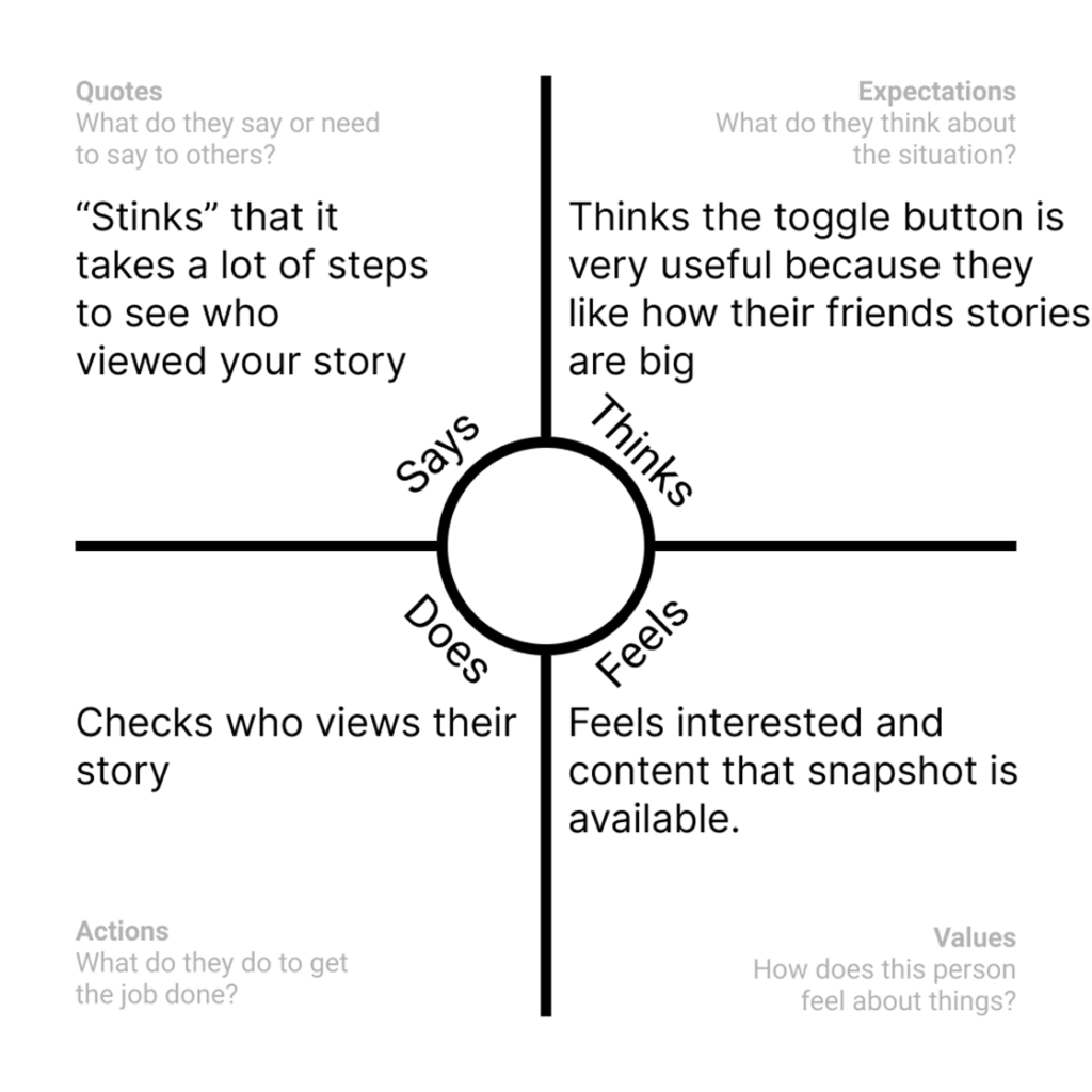
Empathy Map
Step 6: Interviewed three individuals to ask them questions about the initial prototype and from these user interviews, an Empathy Map was created
Usability Testing
Step 7: Interviewed more
The three key takeaways from the usability test were:
- The switch button is not clear for users to understand that it changes the placement of friends and discover stories.
- The users were quickly able to identify how many stories each user had uploaded to their story. The reason for this was because of the only numbers on the page.
- The users liked the idea of the snapshot of their own stories.