
About
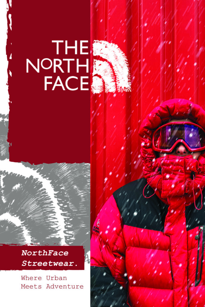
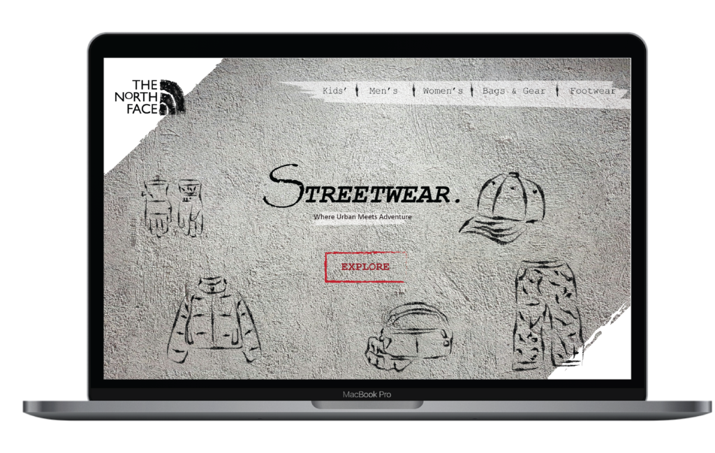
This case study explores a strategic initiative aimed at enhancing The North Face brand by introducing a promotional discount for global stores, redesigning the logo, and creating a magazine to showcase these initiatives.
Goal
To adopt a playful, streetwear- inspired aesthetic, the campaign sought to attract a younger audience.
To enhance The North Face brand’s image, extensive research was conducted on leading streetwear brands such as Supreme, Bape, and Off-White. This analysis revealed key design elements that contribute to their appeal, notably the use of rich textures and layered aesthetics that create a distinctive identity.
The research highlighted that simplicity, combined with impactful identity design elements, effectively fills space and draws attention without overwhelming the viewer.
Challenges
One of the primary challenges was to successfully integrate elements that would give The North Face a fresh and modern appearance while preserving the new design resonated with a younger audience without losing the core attributes that loyal customers associate with the brand.
In addition, developing the magazine posed its own set of challenges. Key considerations include the effective use of color, shape, and photography to achieve a minimalist yet bold and expressive layout.